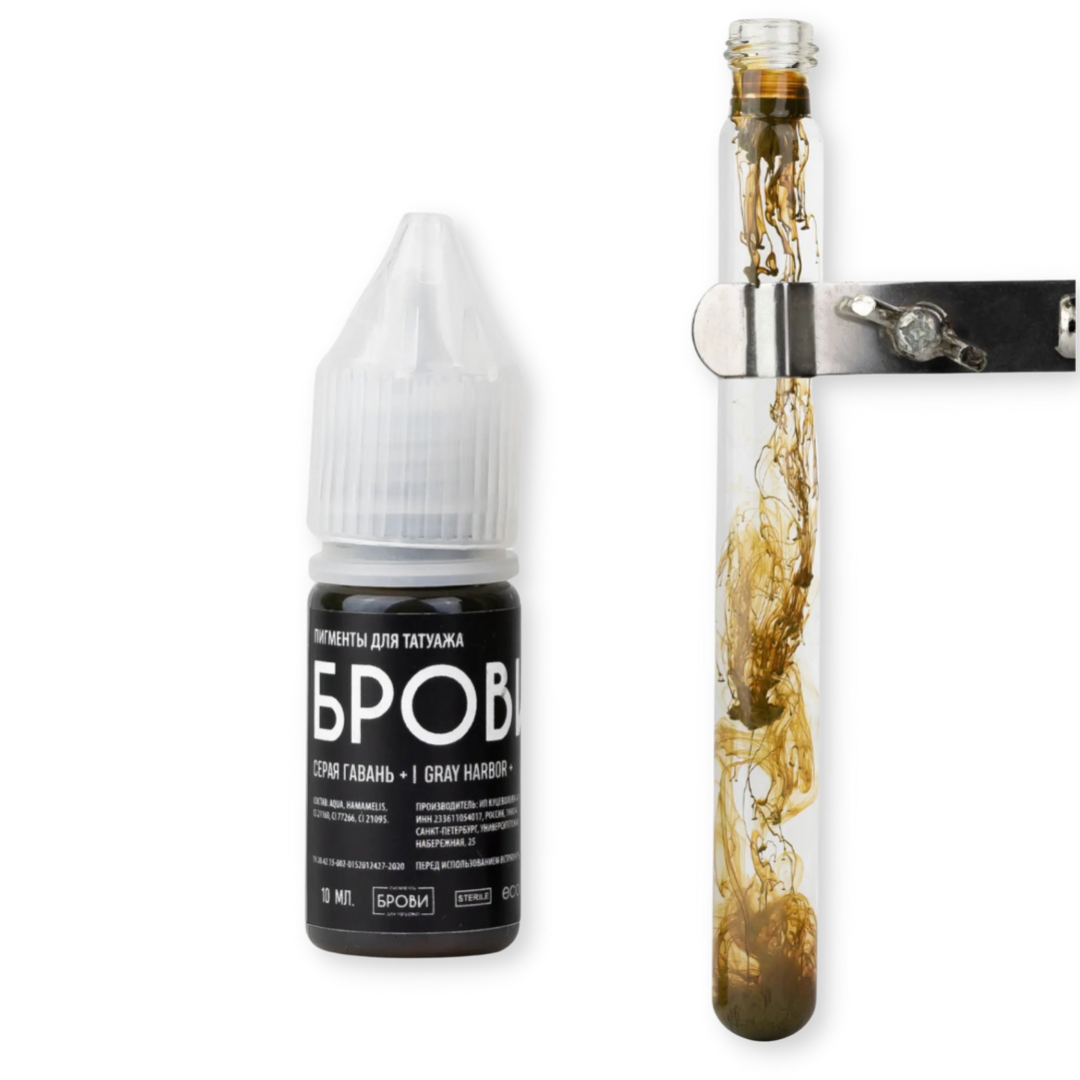
BROVI+ Gray Harbor has a warmer base than regular Gray Harbor pigment.
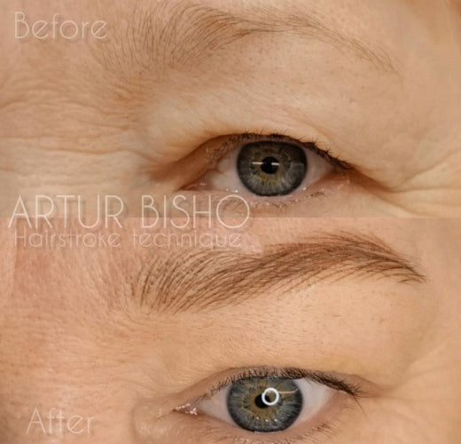
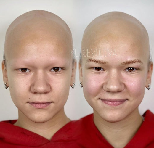
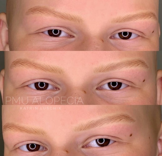
Description: Neutral blond pigment, for ash blondes. Handles ageing skin very well. Designed to treat Fitzpatrick phototype II (Nordic). Recommended for clients with cool hair color. The pigment particles are finely dispersed. The ink is extremely liquid and requires dilution with a special diluent only to adjust the colorant concentration.
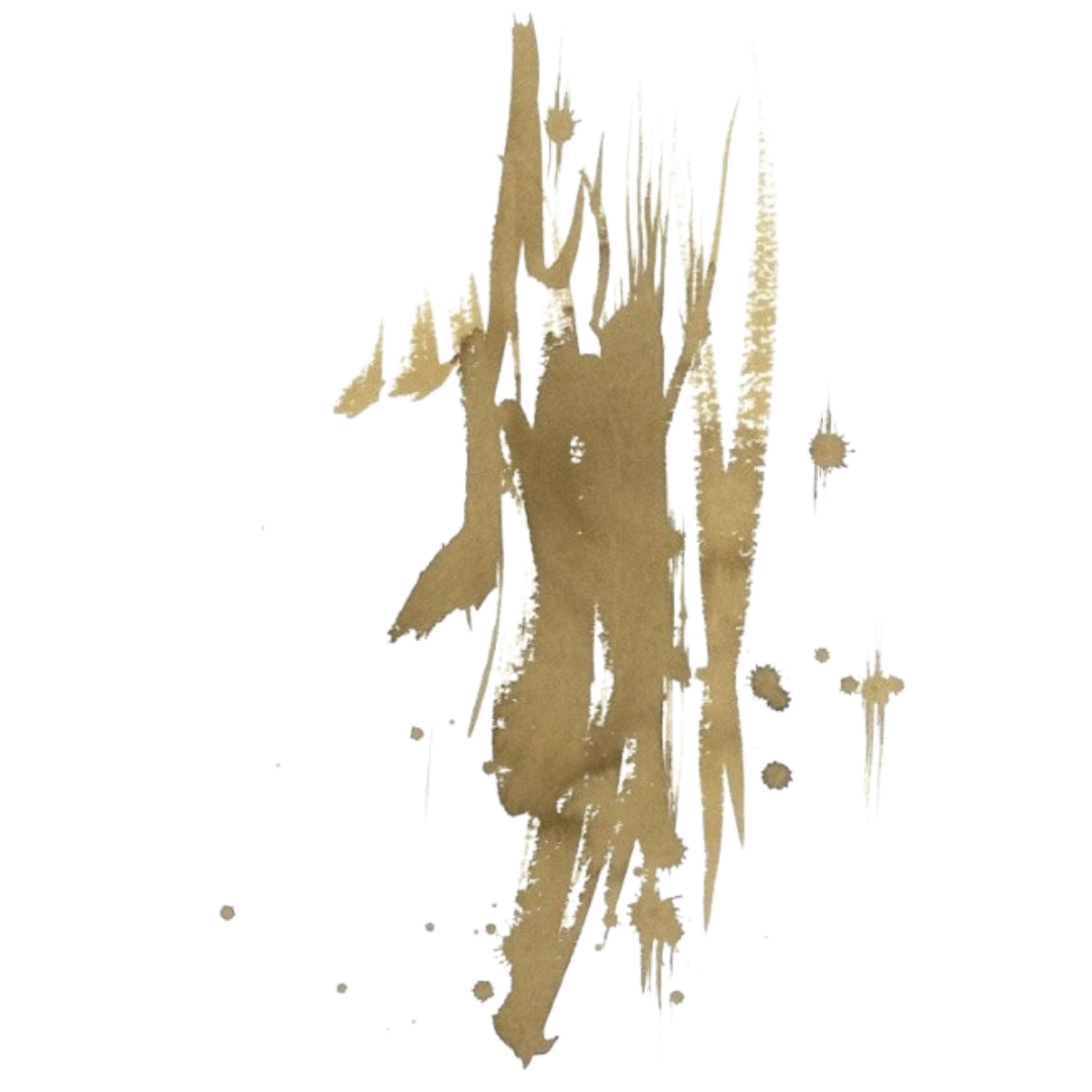
Color: blond
Base: yellow
Color temperature: neutural
Retention rate: 80-90%
Application method: It can be implanted with more intensity: fine particles and warm base will prevent deep sinking of pigment. It can be mixed with Gray Harbor for a beautiful neutral brown tone.
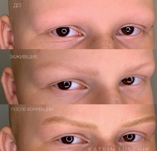
Application of dilutor: required
Reaction to laser: pigment particles are easily fragmented and quickly removed from the skin
Reaction to remover: good contact without side effects
Volume: 10ml
Ingredients: Aqua, Hamamelis, CI 21160, CI 77266, CI 21095
What is the difference between the Brovi & Brovi+ lines?
What is the difference between the Brovi & Brovi+ lines?
All pigments from the basic Brovi brow line have aqua, Hamamelis virginiana extract, glycerin, and alcohol in their formulas. The only difference between the mixes is colorants.
In the Brovi+ line formula, there is no alcohol and no glycerin, only deionized water, Hamamelis extract, and various colorants.
Besides differences in ingredients, in the Brovi+ line, pigments have a warmer formula, and color particles are much smaller than in the basic Brovi line.
The Brovi+ line pigments are more liquid than the regular Brovi line, which makes them perfect for the hair strokes technique and for the powder brows technique when you want to achieve natural and airy results.
How to mix colors from Brovi and Brovi+ lines
How to mix colors from Brovi and Brovi+ lines
If regular Brovi pigments are too cool and saturated for your client, you can mix them with Brovi+ in a 50/50 proportion.
However, that rule doesn't apply to Gray Harbor and Freckle. These pigments won't change color when mixed with their Brovi+ correspondent pigments.
If Brovi+ pigments are very light for your client, you can add a corresponding color from the Brovi line and mix them together. For example, you can add 7 drops of regular Roasted Chestnut to 3 drops of Roasted Chestnut+ (you may adjust the proportions depending on the desired saturation).
You can mix the opposite colors from the Brovi+ line. For example, Gray Harbor+ & Bitter Chocolate+. When mixing these colors, you will receive a neutral brown color that will look natural when healed.
There is no sense in mixing Roasted Chestnut+ & Bitter Chocolate+ because both colors have a warm orange base. Also, you shouldn’t mix any color from Brovi+ line with Freckle+ or add the corrector, because this line is already very warm.
Organic or inorganic?
Organic or inorganic?
Brovi pigments are a hybrid. This means that they consist of both organic and inorganic components. It is wrong to think that organic is good and non-organic is bad, or vice versa. Organic components are produced as a result of organic synthesis, and inorganic components are natural and mineral components that are produced as a result of their processing and enrichment. Hybrid pigments are contemporary types of pigments that most pigment companies manufacture nowadays.
Are there iron oxides in Brovi pigments?
Are there iron oxides in Brovi pigments?
Since Brovi pigments are a hybrid (they have both organic and inorganic components ), iron oxides are present in them.
But don’t get scared of that! Iron oxides are absolutely safe and can be found in many other pigments, as well as in perfumes and some food. For example, yellow iron oxide is one of the ingredients in face foundations.
In Brovi pigments, we use red iron oxide CI7491.
Learn more about Brovi Pigments
To learn more about Brovi Pigments please go to Main Menu - Color Charts - Brovi Color Charts - Brovi FAQ